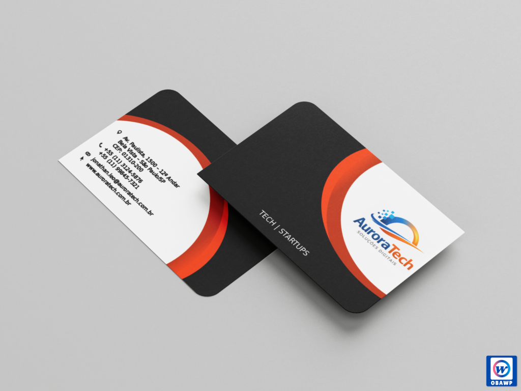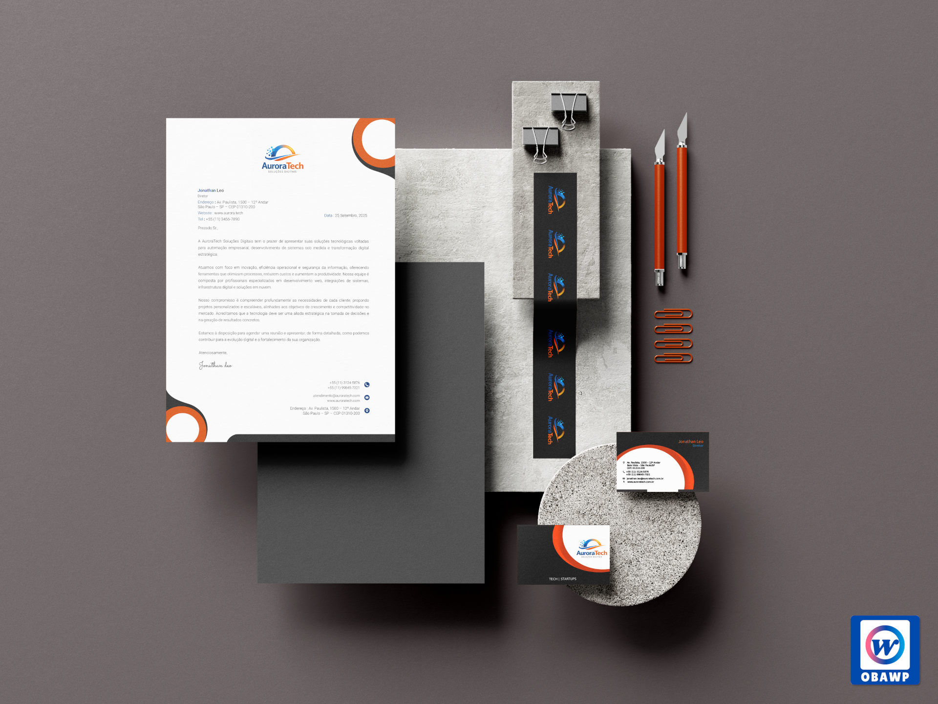
A design was created for the letterhead and double-sided business cards. The logo features an orange circle in a gradient with blue, representing the aurora borealis. The design uses orange as the primary color and blue as the secondary color. I believe that using two primary colors, orange and blue, would make it too colorful, and since it's a technology company for startups, too much color would make it less impactful. So the solution was to use only orange with blue details in the text and icons.